How can you as the designer use principles of design to help compose a page?
Moderately use several of the principles to create the desired effect of the design.
What are the principles of design?
Balance, Emphasis, Rhythm, Unity, Movement, Harmony, Motion
Or C.R.A.P.
Contrast, Repetition, Alignment, Proximity
For each of the 4 principles of C.R.A.P., find an example that utilizes the principle within the design. You should have 4 DIFFERENT sample designs. For each, discuss how the particular principle is used.
CONTRAST
The image here is showing the utility of contrast. using dark colors for the text on a lighter background on the "good" side, which is very easy to read, where similar colors of barely different shades are shown on the "bad" side, being very hard to read.
REPETITION
The design in using only hands which repeat itself in a circular form, giving the design a sense of unity.
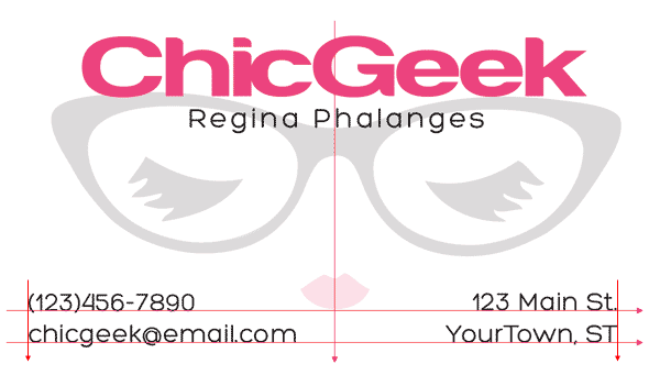
ALIGNMENT
The design employs a simplistic, symmetrical alignment on the center of the image, effectively making use of all the space on the medium and properly making use of the opaque design underneath the text.
PROXIMITY
This image groups squares together, forming the shape of a rectangle, implying a sense of symmetry, however some of the squares are tilted and shrunken to smaller sizes, indicating a sense of falling out from the rest of the shapes.
Also answer the following questions in your own words.
How do you add a later mask to a particular layer?
Click on the masking button under the layers tab and use the brush tool to create your mask
What two colors are used to create the mask?
Black and white
Describe the process of using a layer mask?
Use the black to "mask" parts of your image, and use white to "reveal" other parts of your image


No comments:
Post a Comment