Shape
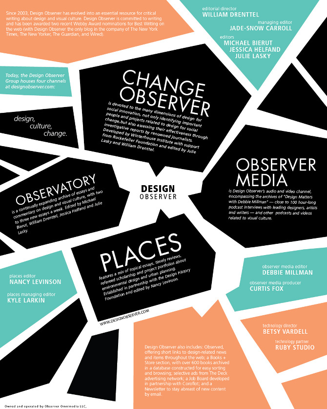
 Many shapes are used in this design and they are arranged in a haphazard yet organized manner. With text being placed within the different shapes, the eyes of the viewer are given lots of action to focus on. Each of the shapes are not necessarily structured or "basic" like a simple triangle or a parallelogram. Most of the shapes actually contain convex and concave "blemishes" which make the poster appear more wild, or exciting overall.
Line
 The design utilizes more curved, bold, and colorful lines to convey its message. With these lines of enhanced color, the poster seems to be advertising something fun. With the bold and softly curved lines, the design appears more relaxed which somewhat contrasts the effect of the bright colors which contrast with the white text. Curved lines everywhere with bright colors could indicate something that has to do with the 70s or 80s culture.
Texture
 While the overall image appears smooth, it also appears popped up, which gives the poster a childish atmosphere. The main smoothness of the poster makes the image appear more simplistic despite the details which are scattered all over the poster. The 3D-like texture of the image gives a sense of excitement. The smooth-flatness gives off a sense of nostalgia and simplicity.
Space
 The poster uses negative space to bring attention to the shape it portrays. By putting the silhouettes in negative instead of positive space, the creator of this image makes the people who are depicted appear innocent due to their white/pure coloration. The use of negative space also allows the designer to utilize several shades of blue for the poster. Blue typically gives off a sense of serenity and calmness. However, on a psychological factor, the color blue is often linked to concentration as it easily attracts the human eye, therefore the use of negative space allows the designer to use blue for the majority of the image, forcing the poster's viewers to remain fixated with the design.
Value
 This image uses dark values of red to portray a more cynical and harsh message to its viewers. The centered white text gives extreme contrast to the darker surroundings and gives much more focus to the message. The image also tends to use darker shades around the corners so it appears that the message is either shooting out of the darkness, or the darkness is approaching the message. The shading is overall even however the random splotches of lighter values in the overall dark areas of the image give off a more violent and gritty mien to the poster.
No comments:
Post a Comment