What is the pen tool used for?
The pen tool creates anchor points which define a path that will eventually create a shape once the final anchor point is connected to the original anchor point.
How can you manipulate a path/line in Illustrator? Discuss the use of the white arrow tool, Pen+, Pen-, and convert tool.
In basic terms, the way to manipulate paths and lines through Illustrator is to simply select them and move them to your liking. The Pen+ tool allows you to add additional anchor points to your shape and thus allows you to add extra textures such as bumps or crevices. The Pen- Tool removes anchor points and can cause shapes such as circles to become half circles, or for parallelograms to become triangles. The convert tool allows you to curve paths as you select your anchor points. The white arrow tool is the main manipulator which can stretch or squish your shapes if used properly, and it also has the ability to remove paths without distorting the shape like the Pen- Tool does.
How can you utilize the layers palette in Illustrator?
Layers are very good to use in Illustrator especially when you are creating a background, or if you are tracing something. By using layers, you prevent the distortion of other segments of your design as you continue attempting to manipulate a separate area of the work.
How can you create a clipping mask in Adobe Illustrator?
To create a clipping mask, you must first create the shape which you want to use as the mask, then you move the clipping path above the objects you want to mask, and finally you select both the clipping path and objects you want to mask.
Wednesday, October 1, 2014
Post #5
For each of the 5 elements of design (shape, line, texture, space, value), find an example that utilizes each element within the design. You should have 5 DIFFERENT sample designs. For each, evaluate the design in 4 to 5 sentences. Label each with the appropriate element. Then, discuss how that particular element is used and how it enhances the design.
Shape
 Many shapes are used in this design and they are arranged in a haphazard yet organized manner. With text being placed within the different shapes, the eyes of the viewer are given lots of action to focus on. Each of the shapes are not necessarily structured or "basic" like a simple triangle or a parallelogram. Most of the shapes actually contain convex and concave "blemishes" which make the poster appear more wild, or exciting overall.
Line
 The design utilizes more curved, bold, and colorful lines to convey its message. With these lines of enhanced color, the poster seems to be advertising something fun. With the bold and softly curved lines, the design appears more relaxed which somewhat contrasts the effect of the bright colors which contrast with the white text. Curved lines everywhere with bright colors could indicate something that has to do with the 70s or 80s culture.
Texture
 While the overall image appears smooth, it also appears popped up, which gives the poster a childish atmosphere. The main smoothness of the poster makes the image appear more simplistic despite the details which are scattered all over the poster. The 3D-like texture of the image gives a sense of excitement. The smooth-flatness gives off a sense of nostalgia and simplicity.
Space
 The poster uses negative space to bring attention to the shape it portrays. By putting the silhouettes in negative instead of positive space, the creator of this image makes the people who are depicted appear innocent due to their white/pure coloration. The use of negative space also allows the designer to utilize several shades of blue for the poster. Blue typically gives off a sense of serenity and calmness. However, on a psychological factor, the color blue is often linked to concentration as it easily attracts the human eye, therefore the use of negative space allows the designer to use blue for the majority of the image, forcing the poster's viewers to remain fixated with the design.
Value
 This image uses dark values of red to portray a more cynical and harsh message to its viewers. The centered white text gives extreme contrast to the darker surroundings and gives much more focus to the message. The image also tends to use darker shades around the corners so it appears that the message is either shooting out of the darkness, or the darkness is approaching the message. The shading is overall even however the random splotches of lighter values in the overall dark areas of the image give off a more violent and gritty mien to the poster.
Shape
Many shapes are used in this design and they are arranged in a haphazard yet organized manner. With text being placed within the different shapes, the eyes of the viewer are given lots of action to focus on. Each of the shapes are not necessarily structured or "basic" like a simple triangle or a parallelogram. Most of the shapes actually contain convex and concave "blemishes" which make the poster appear more wild, or exciting overall.Line
The design utilizes more curved, bold, and colorful lines to convey its message. With these lines of enhanced color, the poster seems to be advertising something fun. With the bold and softly curved lines, the design appears more relaxed which somewhat contrasts the effect of the bright colors which contrast with the white text. Curved lines everywhere with bright colors could indicate something that has to do with the 70s or 80s culture.Texture
While the overall image appears smooth, it also appears popped up, which gives the poster a childish atmosphere. The main smoothness of the poster makes the image appear more simplistic despite the details which are scattered all over the poster. The 3D-like texture of the image gives a sense of excitement. The smooth-flatness gives off a sense of nostalgia and simplicity.Space
The poster uses negative space to bring attention to the shape it portrays. By putting the silhouettes in negative instead of positive space, the creator of this image makes the people who are depicted appear innocent due to their white/pure coloration. The use of negative space also allows the designer to utilize several shades of blue for the poster. Blue typically gives off a sense of serenity and calmness. However, on a psychological factor, the color blue is often linked to concentration as it easily attracts the human eye, therefore the use of negative space allows the designer to use blue for the majority of the image, forcing the poster's viewers to remain fixated with the design.Value
This image uses dark values of red to portray a more cynical and harsh message to its viewers. The centered white text gives extreme contrast to the darker surroundings and gives much more focus to the message. The image also tends to use darker shades around the corners so it appears that the message is either shooting out of the darkness, or the darkness is approaching the message. The shading is overall even however the random splotches of lighter values in the overall dark areas of the image give off a more violent and gritty mien to the poster.
Post #4
Why/how can icons be used to communicate?
Icons are able to express messages to people because of its ability to draw attention to others and effectively convey what it is meant to represent with very little detail and simplistic design.
Via the internet, find 2 examples of common icons that clearly communicate their message.
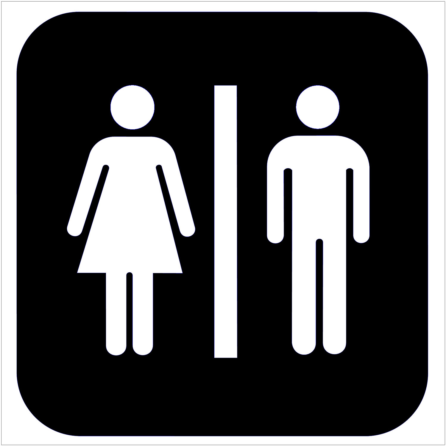

I chose a restroom sign and a warning sign because people see these images practically everywhere they go. They are both simple yet easily recognizable signs which properly convey their messages, as the restroom sign conveys an area for men and women to enter and the warning sign shows exclamation, which could be synonymous to warning.
What is the difference between copyright and public domain?
Copyright "items" strictly belong to the creator and may not be used without permission and citation, however public domain items may be used without consent or citation,
How can you avoid plagiarism in this class? In other classes?
One easy way is to use Google to filter out sources/images which belong to a public domain. Another way to avoid plagiarism is to ask the original source for permission to use their work and to properly cite them. For other classes which require research reports such as History, English, or Science, you could put all of your sources in a designated Works Cited page.
Icons are able to express messages to people because of its ability to draw attention to others and effectively convey what it is meant to represent with very little detail and simplistic design.
Via the internet, find 2 examples of common icons that clearly communicate their message.
I chose a restroom sign and a warning sign because people see these images practically everywhere they go. They are both simple yet easily recognizable signs which properly convey their messages, as the restroom sign conveys an area for men and women to enter and the warning sign shows exclamation, which could be synonymous to warning.
What is the difference between copyright and public domain?
Copyright "items" strictly belong to the creator and may not be used without permission and citation, however public domain items may be used without consent or citation,
How can you avoid plagiarism in this class? In other classes?
One easy way is to use Google to filter out sources/images which belong to a public domain. Another way to avoid plagiarism is to ask the original source for permission to use their work and to properly cite them. For other classes which require research reports such as History, English, or Science, you could put all of your sources in a designated Works Cited page.
Subscribe to:
Comments (Atom)