Compare and Contrast vector graphics and pixel images
Vector graphics have larger files than pixel images, and they can be scaled without disturbing the resolution, whereas pixel images show their enlarged pixels when they are scaled to a bigger size. Pixel images are created with blocks called pixels, whereas vector graphics are created with lines called vectors.
What resolution is necessary to print raster images?
300 dpi
What resolution is necessary to display raster images on the internet?
72 dpi
Tuesday, November 25, 2014
Monday, November 24, 2014
Post #9
Who is Steve Jobs?
Steve Jobs is an American entrepreneur, marketer, and inventor, as well as the co-founder and CEO of Apple
What company was he the CEO of for many years?
Apple
What did he do for the computer industry?
He introduced a multitouch system to computers and introduced multiple capabilities as well as introducing the computer as an object of pleasure rather than convenience.
How did this man impact the graphic design industry?
The Macintosh computer had a GUI (graphical user interface) which allowed real time painting with the use of the mouse on a computer.
Post #8
Why must designers pay close attention to how color is utilized within a composition?
Colors define the atmosphere of the design, so in order to properly convey the message of the design, designers must note the psychology of the colors they use
Why is the color wheel an important tool for graphic designers?
A color wheel helps designers see the relationships between colors and see which colors would be compatible with one another on a design
Find an example of neutral colors utilized within a design. near the sample, discuss why you feel the designer included neutral colors within the composition.

Briefly describe how we "see the" color of an object?
The pigment of an object absorbs white light and reflects colors that it does not absorb, back to our eyes, and that is the color which we "see"
Colors define the atmosphere of the design, so in order to properly convey the message of the design, designers must note the psychology of the colors they use
Why is the color wheel an important tool for graphic designers?
A color wheel helps designers see the relationships between colors and see which colors would be compatible with one another on a design
Find an example of neutral colors utilized within a design. near the sample, discuss why you feel the designer included neutral colors within the composition.

The design uses very earthy tones, which can be considered as a neutral color scheme, but the designer used these colors because it is very easy to look at and it gives off a homey aura as coffee is typically advertised.
Briefly describe how we "see the" color of an object?
The pigment of an object absorbs white light and reflects colors that it does not absorb, back to our eyes, and that is the color which we "see"
Post #7 Video#2 Color Theory (Part 1 and 2)
Part 1
Describe White Light?
Light which is composed of all colors
How do we see color if objects "have no color of their own"?
The colors which are not being absorbed by the object are being reflected by the light hitting the object
What seven colors result when white light is refracted through a prism?
Red Orange Yellow Green Blue Indigo Violet
Describe hue?
Hue is the aspect dependent by its dominant wavelength, but independent of its intensity/lightness
What happens with white?
White reflects all light and cannot be created
What happens with black?
Black absorbs all light, and can be created by mixing primary colors
How color perceived depends on what?
Color perceived depends on the pigments the object absorbs and reflects
What is a color wheel?
A circle with different colored sectors used to show the relationship between colors
What are primary colors? Name them?
Primary colors are the basic colors used that other colors are mixed from
yellow blue red
What are the secondary colors? Name them?
Secondary colors are colors which are derived from mixing the primary colors
Orange, green, purple
What are the tertiary colors? Name them?
Colors which lie between secondary and primary colors
Blue-violet, yellow orange, yellow green, red orange, red violet, blue green
Part 2
What are neutral colors? How can they be created?
Neutral colors are colors that do not necessarily appear on the color wheel, and they can be created by blending two complementary colors together, or by blending all three primary colors together.
How can Neutral color help a design?
Neutral colors sere as a backdrop of a design, and can convey cleanliness and simplicity
What is color value?
Color value is the lightness or darkness of a color
What is a shade?
Shade is when black is added to a color to give it a darker value
What is a tint?
Tint is mixing white to a color to give the color a lighter value
What is saturation/intensity?
Saturation and intensity describe how vivid the design appears
What happens when you mix complementary colors together?
Mixing complementary colors together will create a neutral color
What is a color scheme?
an arrangement or combination of colors
Describe a monochromatic color scheme?
A color scheme which uses various values of a single color
Describe a triadic color scheme?
A color scheme which uses colors separated by three other colors on a color wheel
What colors are considered to be warm colors?
Red, orange, yellow
Describe the psychology of a warm color scheme?
Warm colors invoke a sense of stimulation to the brain, causing active emotions to arise such as hunger, excitement, and rage
What colors are considered to be cool colors?
Blue, green, purple
Describe the psychology of a cool color scheme?
Cool colors are less straining to the eye and invoke a sense of calmness
Why is it important to consider which colors are being used within a design?
Colors influence what type of mood the design is attempting to convey to consumers, so it is important to consider how they would feel when they look at the design
Wednesday, October 1, 2014
Post #6
What is the pen tool used for?
The pen tool creates anchor points which define a path that will eventually create a shape once the final anchor point is connected to the original anchor point.
How can you manipulate a path/line in Illustrator? Discuss the use of the white arrow tool, Pen+, Pen-, and convert tool.
In basic terms, the way to manipulate paths and lines through Illustrator is to simply select them and move them to your liking. The Pen+ tool allows you to add additional anchor points to your shape and thus allows you to add extra textures such as bumps or crevices. The Pen- Tool removes anchor points and can cause shapes such as circles to become half circles, or for parallelograms to become triangles. The convert tool allows you to curve paths as you select your anchor points. The white arrow tool is the main manipulator which can stretch or squish your shapes if used properly, and it also has the ability to remove paths without distorting the shape like the Pen- Tool does.
How can you utilize the layers palette in Illustrator?
Layers are very good to use in Illustrator especially when you are creating a background, or if you are tracing something. By using layers, you prevent the distortion of other segments of your design as you continue attempting to manipulate a separate area of the work.
How can you create a clipping mask in Adobe Illustrator?
To create a clipping mask, you must first create the shape which you want to use as the mask, then you move the clipping path above the objects you want to mask, and finally you select both the clipping path and objects you want to mask.
Post #5
For each of the 5 elements of design (shape, line, texture, space, value), find an example that utilizes each element within the design. You should have 5 DIFFERENT sample designs. For each, evaluate the design in 4 to 5 sentences. Label each with the appropriate element. Then, discuss how that particular element is used and how it enhances the design.
Shape
 Many shapes are used in this design and they are arranged in a haphazard yet organized manner. With text being placed within the different shapes, the eyes of the viewer are given lots of action to focus on. Each of the shapes are not necessarily structured or "basic" like a simple triangle or a parallelogram. Most of the shapes actually contain convex and concave "blemishes" which make the poster appear more wild, or exciting overall.
Line
 The design utilizes more curved, bold, and colorful lines to convey its message. With these lines of enhanced color, the poster seems to be advertising something fun. With the bold and softly curved lines, the design appears more relaxed which somewhat contrasts the effect of the bright colors which contrast with the white text. Curved lines everywhere with bright colors could indicate something that has to do with the 70s or 80s culture.
Texture
 While the overall image appears smooth, it also appears popped up, which gives the poster a childish atmosphere. The main smoothness of the poster makes the image appear more simplistic despite the details which are scattered all over the poster. The 3D-like texture of the image gives a sense of excitement. The smooth-flatness gives off a sense of nostalgia and simplicity.
Space
 The poster uses negative space to bring attention to the shape it portrays. By putting the silhouettes in negative instead of positive space, the creator of this image makes the people who are depicted appear innocent due to their white/pure coloration. The use of negative space also allows the designer to utilize several shades of blue for the poster. Blue typically gives off a sense of serenity and calmness. However, on a psychological factor, the color blue is often linked to concentration as it easily attracts the human eye, therefore the use of negative space allows the designer to use blue for the majority of the image, forcing the poster's viewers to remain fixated with the design.
Value
 This image uses dark values of red to portray a more cynical and harsh message to its viewers. The centered white text gives extreme contrast to the darker surroundings and gives much more focus to the message. The image also tends to use darker shades around the corners so it appears that the message is either shooting out of the darkness, or the darkness is approaching the message. The shading is overall even however the random splotches of lighter values in the overall dark areas of the image give off a more violent and gritty mien to the poster.
Shape
Many shapes are used in this design and they are arranged in a haphazard yet organized manner. With text being placed within the different shapes, the eyes of the viewer are given lots of action to focus on. Each of the shapes are not necessarily structured or "basic" like a simple triangle or a parallelogram. Most of the shapes actually contain convex and concave "blemishes" which make the poster appear more wild, or exciting overall.Line
The design utilizes more curved, bold, and colorful lines to convey its message. With these lines of enhanced color, the poster seems to be advertising something fun. With the bold and softly curved lines, the design appears more relaxed which somewhat contrasts the effect of the bright colors which contrast with the white text. Curved lines everywhere with bright colors could indicate something that has to do with the 70s or 80s culture.Texture
While the overall image appears smooth, it also appears popped up, which gives the poster a childish atmosphere. The main smoothness of the poster makes the image appear more simplistic despite the details which are scattered all over the poster. The 3D-like texture of the image gives a sense of excitement. The smooth-flatness gives off a sense of nostalgia and simplicity.Space
The poster uses negative space to bring attention to the shape it portrays. By putting the silhouettes in negative instead of positive space, the creator of this image makes the people who are depicted appear innocent due to their white/pure coloration. The use of negative space also allows the designer to utilize several shades of blue for the poster. Blue typically gives off a sense of serenity and calmness. However, on a psychological factor, the color blue is often linked to concentration as it easily attracts the human eye, therefore the use of negative space allows the designer to use blue for the majority of the image, forcing the poster's viewers to remain fixated with the design.Value
This image uses dark values of red to portray a more cynical and harsh message to its viewers. The centered white text gives extreme contrast to the darker surroundings and gives much more focus to the message. The image also tends to use darker shades around the corners so it appears that the message is either shooting out of the darkness, or the darkness is approaching the message. The shading is overall even however the random splotches of lighter values in the overall dark areas of the image give off a more violent and gritty mien to the poster.
Post #4
Why/how can icons be used to communicate?
Icons are able to express messages to people because of its ability to draw attention to others and effectively convey what it is meant to represent with very little detail and simplistic design.
Via the internet, find 2 examples of common icons that clearly communicate their message.
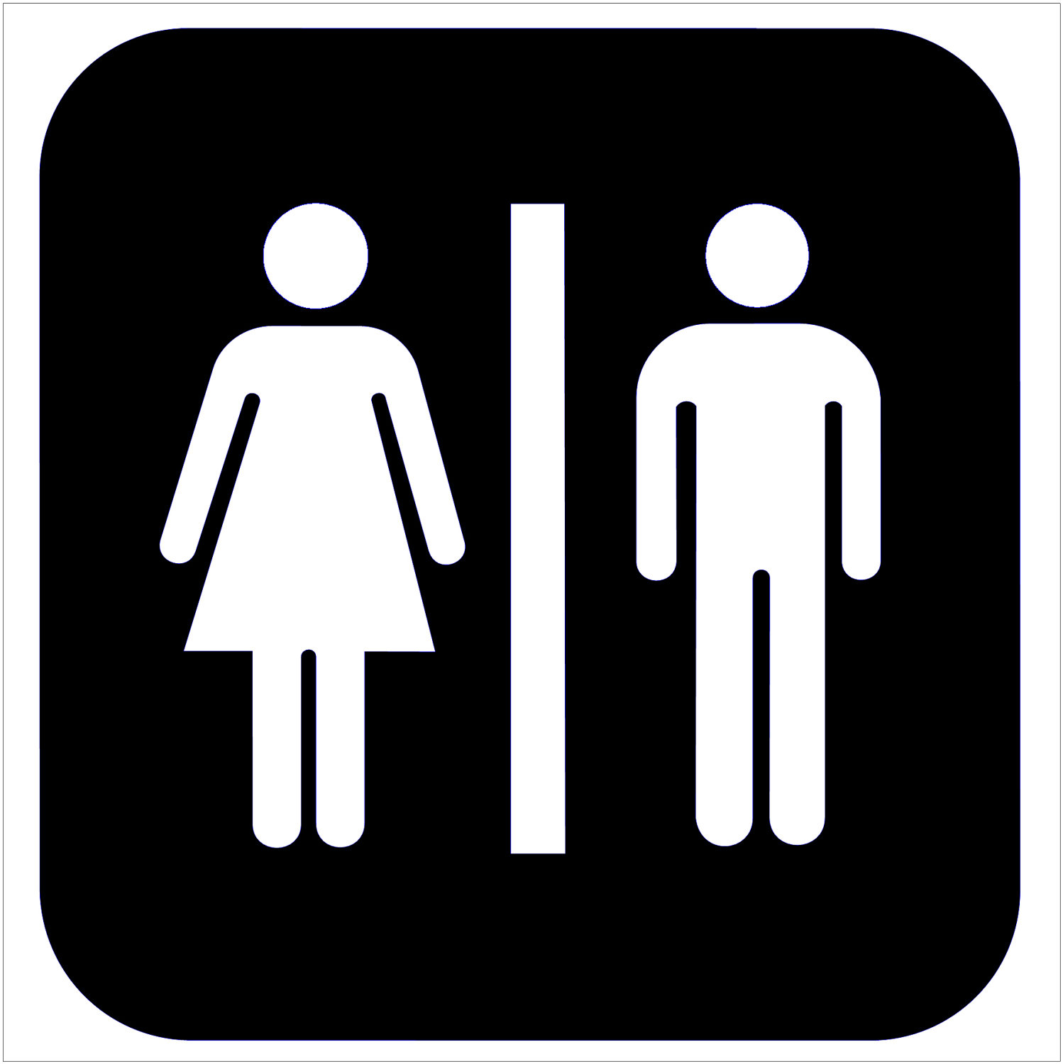

I chose a restroom sign and a warning sign because people see these images practically everywhere they go. They are both simple yet easily recognizable signs which properly convey their messages, as the restroom sign conveys an area for men and women to enter and the warning sign shows exclamation, which could be synonymous to warning.
What is the difference between copyright and public domain?
Copyright "items" strictly belong to the creator and may not be used without permission and citation, however public domain items may be used without consent or citation,
How can you avoid plagiarism in this class? In other classes?
One easy way is to use Google to filter out sources/images which belong to a public domain. Another way to avoid plagiarism is to ask the original source for permission to use their work and to properly cite them. For other classes which require research reports such as History, English, or Science, you could put all of your sources in a designated Works Cited page.
Icons are able to express messages to people because of its ability to draw attention to others and effectively convey what it is meant to represent with very little detail and simplistic design.
Via the internet, find 2 examples of common icons that clearly communicate their message.
I chose a restroom sign and a warning sign because people see these images practically everywhere they go. They are both simple yet easily recognizable signs which properly convey their messages, as the restroom sign conveys an area for men and women to enter and the warning sign shows exclamation, which could be synonymous to warning.
What is the difference between copyright and public domain?
Copyright "items" strictly belong to the creator and may not be used without permission and citation, however public domain items may be used without consent or citation,
How can you avoid plagiarism in this class? In other classes?
One easy way is to use Google to filter out sources/images which belong to a public domain. Another way to avoid plagiarism is to ask the original source for permission to use their work and to properly cite them. For other classes which require research reports such as History, English, or Science, you could put all of your sources in a designated Works Cited page.
Friday, September 5, 2014
Post #3
What is OSHA? What do the letters stand for?
OSHA stands for "Occupational Safety Health Administration," and they are made to ensure the safety for all employees
How can graphic designers effectively communicate? In your own words, explain the communication process.
Graphic designers utilize all six elements of design to effectively convey their messages to other people. By using one or several elements, they can morph the meaning or undertones of their message, relaying a more specific message to their audience or peers.
Understanding the history, culture and movements of fine and graphic arts will make you a better producer of visual messages. Why?
By having a better understanding of the culture/background an artist is trying to portray, that artist will be able to convey his/her message far more effectively than basing his/her style in the design with common stereotypes, causing him/her to inaccurately portray the piece.
Thursday, September 4, 2014
Post #2
What does it take to create good graphic design?
It requires the understanding of the elements and principles of graphic design
What is the difference between elements and principles?
Elements are the components of the design, or what we actually create as designers, and principles guide us on how to organize these elements.
Name the six (6) elements of design.
Shape/Form, Color, Value, Space, Texture, Line
What can lines aid in, when alone or combined with other lines or shapes?
Lines form the shape of an image, and can help convey specific meanings of a message. They can shape the "readability" or the appearance of the design.
Which lines suggest a feeling of rest? Why do you think?
Horizontal lines suggest a feeling of rest because of its resemblance to the ground. By being similar to the ground, it gives off the impression of something that is down, or inactive.
Vertical lines communicate a feeling of what? Why do you think?
They communicate a feeling of "loftiness" because of their resemblance to anything tall such as skyscrapers or redwood trees.
What lines suggest a feeling of movement? Why do you think?
Diagonal lines suggest a feeling of movement because diagonal lines resemble slides which utilize the force of gravity to move people down quickly to the ground.
Soft, shallow curved lines suggest what? Why do you think?
Soft curved lines suggest these feelings of rest because many objects left at rest make shallow curves, such as a pillow, or the curve of a body lying down.
These lines suggest confusion and turbulence? Why do you think?
What element defines a specific area of space? What is the difference between two dimensional shapes and three dimensional shapes?
Describe the difference between geometric shapes and organic shapes?
Geometric shapes are structured, and often appear symmetrical, whereas organic/natural shapes are often irregular/fluid, and can be man-made, or found in nature.
What are abstract shapes?
Which basic shape projects an attitude of honesty or equality?
Squares
What do triangles suggest?
Action or stability
Squares
What do triangles suggest?
Action or stability
Circles convey feelings of what?
Protection or infinity
Positive space is the space used by the designer to form an image--the shapes/lines/graphics of the design, whereas the negative space is where the designer shows where the image ends, or gives the audience as place for their eyes to rest.
Texture is the actual surface of the design, where the audience can legitimately feel the texture of the paper or materials of the design. By incorporating texture, a feeling of "richness and depth" is added to the design.
Value is the degree of dark and light of a design, and gives the design a sense of contrast
What is another name for value? What can the element of color do when incorporated into a design?
Value can also be referred to as "tone." Color, when used in graphic design, can create images, convey moods, or identify objects.
Value can also be referred to as "tone." Color, when used in graphic design, can create images, convey moods, or identify objects.
Friday, August 29, 2014
Post #1
Why did you take this class? What goals do you have for the class?
I chose to take this class because my older siblings and several [former] upperclassmen who I know took this class before, and all of them stated that they enjoyed it. They all mentioned making stickers as well, so I look forward to doing that too. I don't really have many goals other than to have fun in this class, though I look forward to improving my computer skills and artistic abilities.
I chose to take this class because my older siblings and several [former] upperclassmen who I know took this class before, and all of them stated that they enjoyed it. They all mentioned making stickers as well, so I look forward to doing that too. I don't really have many goals other than to have fun in this class, though I look forward to improving my computer skills and artistic abilities.
Subscribe to:
Posts (Atom)